AGCO Foundation
Rebrand the foundation to appeal to a younger audience and to stand out through social media communication channels.


The challenge
The AGCO Foundation was doing great work supporting emerging agricultural projects around the globe, but the brand was looking tired and old-fashioned. The logo didn’t work on many of its communication channels and lacked the presence required to stand out and connect with a young global audience.
The foundation wasn’t really known or understood, not only internally in AGCO but externally in the wider global agricultural market either.
AGCO was redefining the pillars that underpinned the foundation, making them more in line with AGCO’s own. “Putting Farmers First, advancing smart farming technology and strengthening the business for the future.”
The work
- Brand Strategy
- Full Rebrand
- Design of asset pack for brand launch
- Continued communication support
- Annual - Year In Review for the foundation



The story
The AGCO Foundation found itself doing some great work supporting emerging farmers using innovative technology and processes in developing countries. But few in the AGCO business had heard of the foundation, even those who had heard very little about what they did.
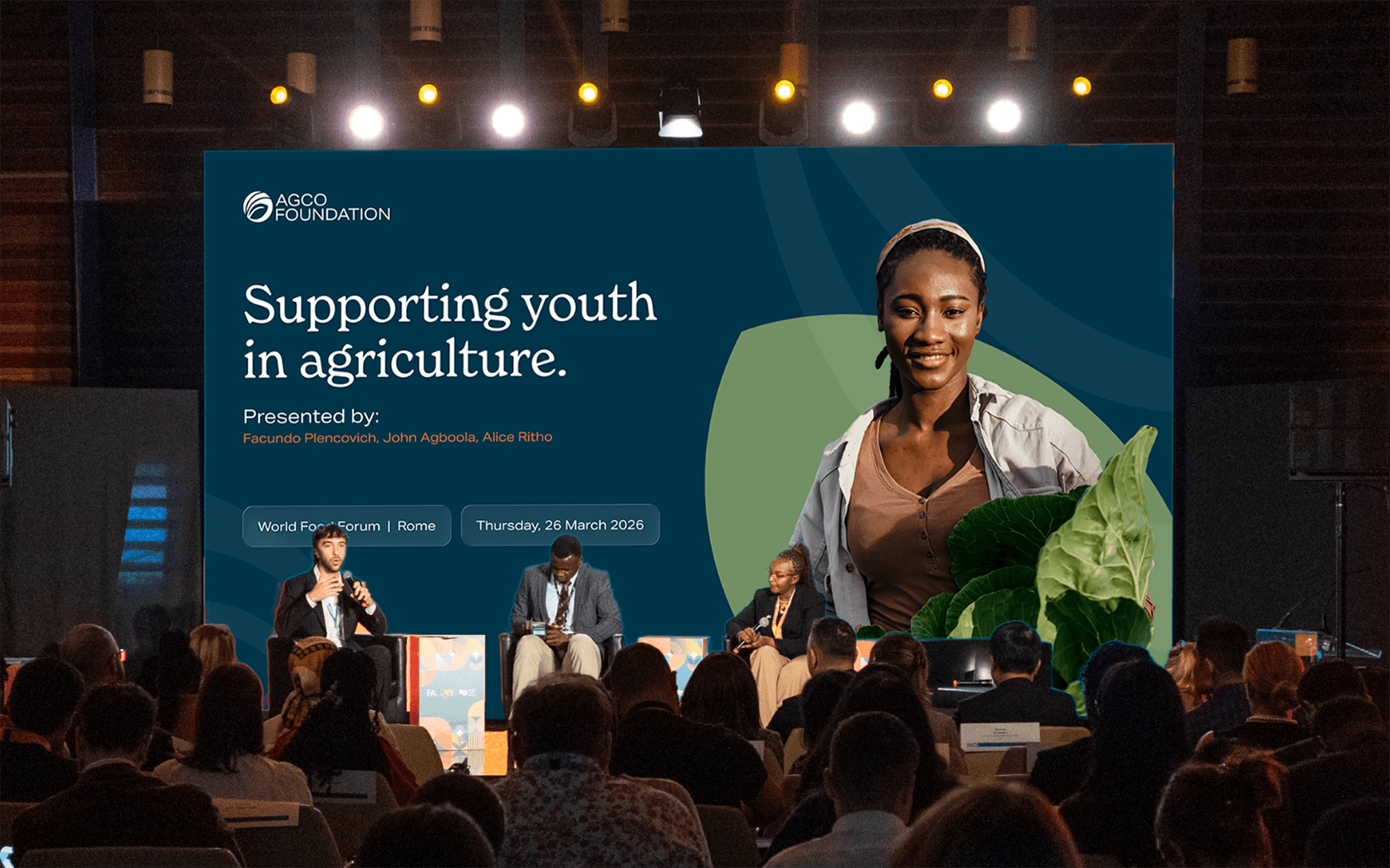
The foundation wanted to align itself more with the direction of AGCO. Prioritising the next generation of ag-leaders and young farmers in its efforts to drive a more focused impact.
The result
During the investigation phase, the foundation also decided it was time to change its name to AGCO Foundation. We also established the Why…
The Why?
- Reflects the Foundation’s name change and aligns more closely with AGCO’s brand identity
- Designed to appeal to a younger generation and work seamlessly across modern communication platforms
- Replaces the dated 2018 design with a more flexible and contemporary look for social and digital content
- Supports a refreshed strategic direction and strengthens visual consistency across all touchpoints
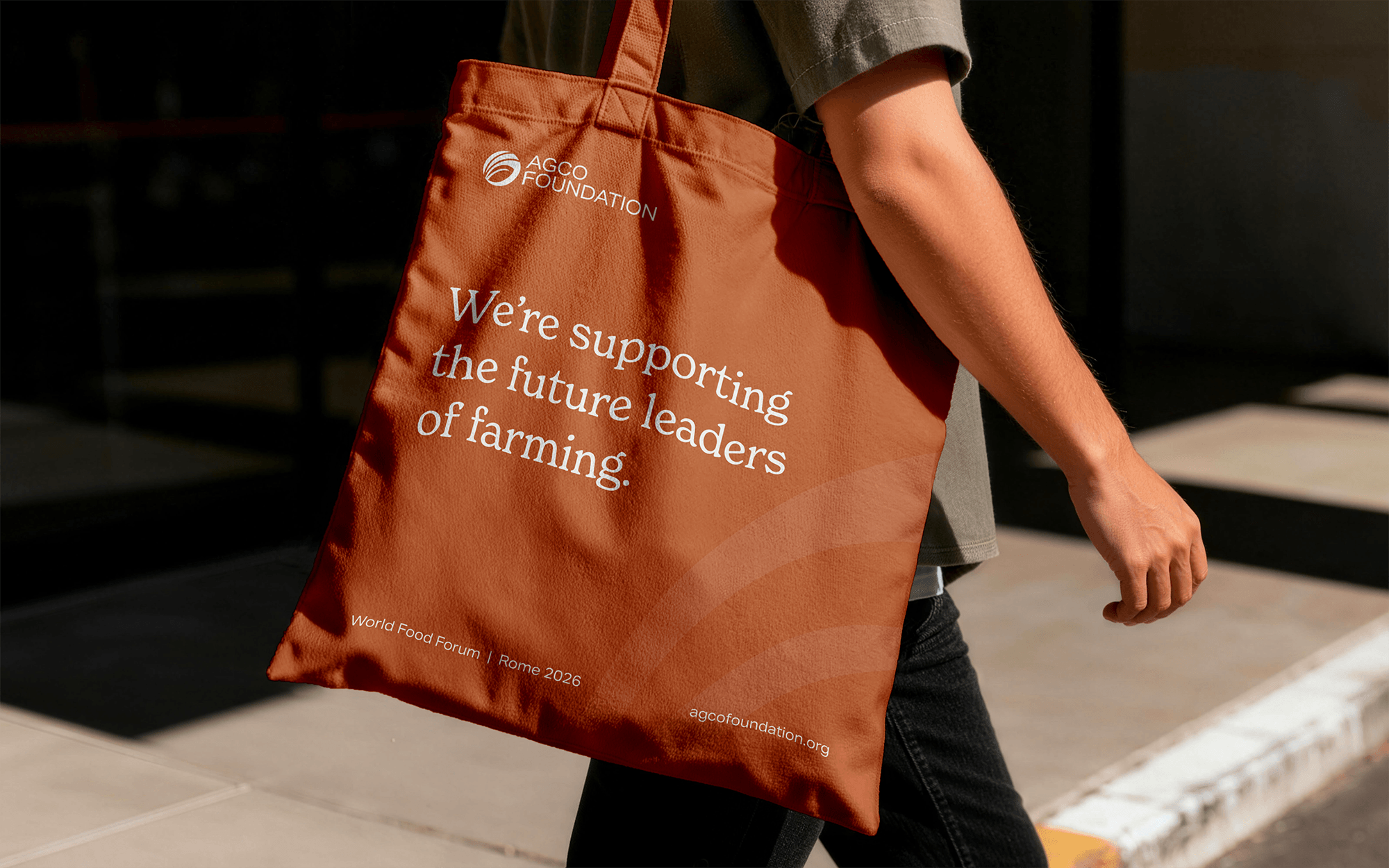
The Foundation was given an icon that represented the global reach and its agricultural base. With a more energetic and youthful colour palette. Typefaces that were accessible and friendly while still feeling professional and dependable.
The happy customer...


.webp)
.webp)

.webp)
.png)


Join our tribe
+ get a FREE social media content planner

